By John Engel
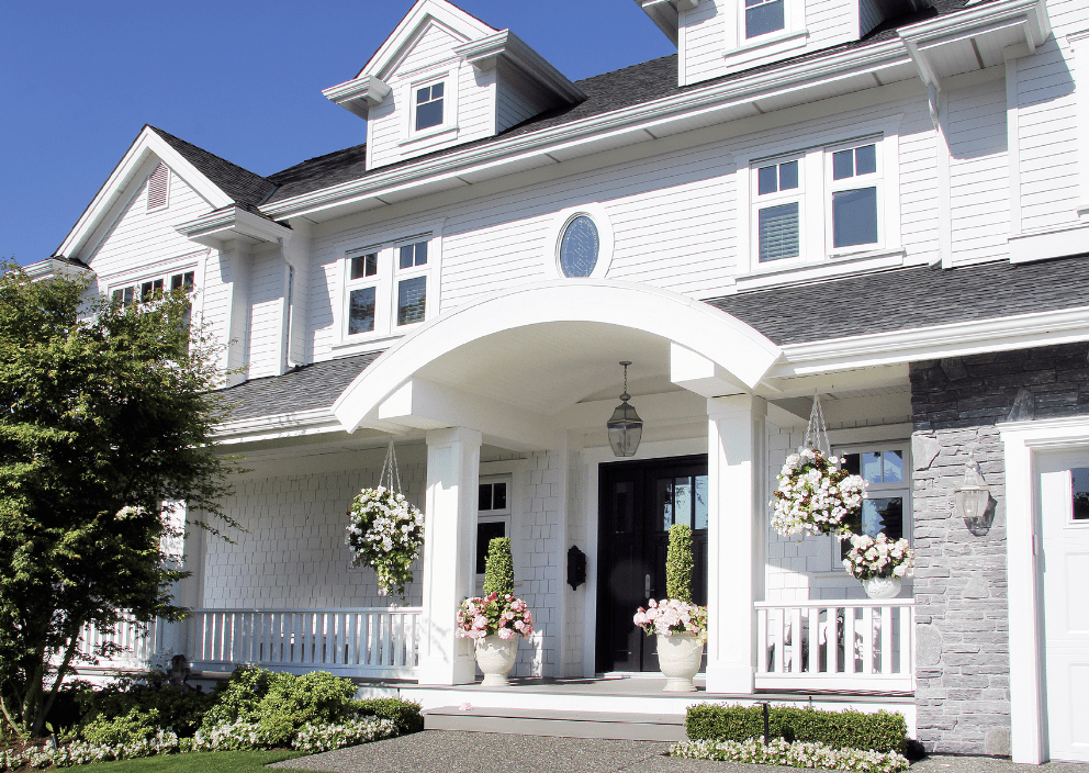 White dominates — in cars (27.6%), kitchens (43%), and siding (34%). And in New Canaan, Darien, Westport, Rowayton and Greenwich — where the 2025 median home price is over $2 million — a 0.61% problem, like Zillow’s sale-price loss for white bathrooms, means $12,200. So why do we keep choosing white if it costs us money? This is the paradox: white is what we trust, not what performs.
White cars are still #1 — 27.6% of U.S. sales. Grayscale (white, black, gray and silver) are now 78.5%.
Colors? Park ’em — they’re less than 20%. Globally, white has led for 12 straight years. Since 2004, white’s market share has nearly doubled. The rainbow is shrinking. But with cars, white wins for different reasons: cheaper to paint, hides scratches, reflects heat, easy to resell. Utility, not emotion.
White kitchens are still the most common choice — 43% of renovations (Houzz, 2024). But again, it’s not the most profitable. Zillow studies (2023) say gray kitchens add $2,512 to the average home’s value. White kitchens lose $612. White bathrooms lose $4,035 — a 0.61% hit (as mentioned above, that’s $12,200 for the median home in our area). We choose white, but buyers want and will pay more for a something more custom. What signals custom like color?
And it’s not just paint. Many of us can date a kitchen by the countertops. Twenty-five years ago, it was polished granite — Baltic Brown, Uba Tuba, Black Galaxy. Then came the era of contrasting kitchen islands, styled like furniture. Today, it’s marble or quartz or soapstone or polished concrete that mimics marble. Lighter, softer, less shiny. And always white or pale gray. The trend has shifted not only in color but in finish. Honed, not glossy. Natural, not busy.
White and off-white exteriors now make up 34% of siding choices, more than double since 2018. Gray leads in the Northeast, white in the South and West. But color isn’t just trend — it’s context. Years ago, on Oenoke Lane, we painted our house in three carefully chosen shades of sage with khaki trim. The contrasting salmon-colored door took three tries. People knocked just to ask what colors we used. Sometimes the right color isn’t popular — it’s personal. A dozen years later, the sage remains but without the salmon.
White paint still rules. Benjamin Moore and Sherwin-Williams list whites like “White Dove” and “Alabaster” as top sellers. Among U.S. interior paint sales, white is $12.3B (Statista, 2023). Nearly half are neutral tones.
Benjamin Moore alone offers over 150 shades of white. “Simply White,” “Cloud White,” “Chantilly Lace,” “Swiss Coffee.” Slight shifts in undertone can make or break a room. Blue light? Choose warmer white. North exposure? Go creamy. The right white isn’t always default. Sometimes it’s the most deliberate choice you can make.
White surged after the 1918 Spanish Flu, when it connoted hospital-clean, germ-free, and modern. Post-COVID? Not this time; we shifted to beige, greige, and warm whites. But not all neutrals feel the same. A Frontiers in Psychology study (2021) found achromatic spaces — like white and gray — were consistently rated as more peaceful, orderly, and spacious than saturated colors. White isn’t just neutral; it’s tranquil. But that tranquility can sometimes feel clinical.
Why white? It’s safe. And it’s safe because it works. The National Association of Realtors says 82% of stagers recommend neutrals (NAR, 2022). But it’s also emotional. Years ago, we asked each other if we could paint over the antique paneling. My sister wrestled with the same in her house. Sometimes it feels like asking permission, like we’re disrespecting the original fine finish.
Clients hesitate, “Can I bleach this floor? Darken it?” The answer’s always yes. The trend in floors is clear: away from the yellow of a basketball court, toward pale, cool woods. Less gold, more gray.
We choose white because it’s safe. It’s best for resale. It’s a neutral backdrop for art and furniture. It’s easy to visualize. Colored walls and floors fade unevenly; white doesn’t.
We often criticize white when it represents the absence of a decision. What’s missing is the deliberate, thoughtful choice — one that considers room size, natural light, mirrors, trim, carpets, paneling. White can be default. But the right white, chosen well, is anything but.
Homes vs. cars. We choose white in homes for flexibility, resale, light, and perceived cleanliness. In cars, it’s different; white is cheaper to paint, hides scratches, reflects heat. Because white shows up in fleets (Uber, rental, municipal), we know it’s a choice that’s not always about taste. Sometimes, it’s just logistics.
We trust white. It’s familiar, flexible, forgiving. But here in Fairfield County, the difference between the right color and the wrong one, even a small percentage swing, can mean six figures. And the data are clear: white isn’t always the premium choice. Buyers prefer warmth, subtle contrast, and a sense of intention. Ten years ago, I painted a new build in town Platinum Gray. Not purple-gray. Not beige-gray. Not a color. Platinum was just right, and it still looks perfect. But could I have made a bolder choice?
Notes from the Monday Meeting
I’m learning that there is little correlation between open house numbers and offers. In one case, poor attendance in the rain on Father’s Day weekend led to an offer on Monday, while a packed open house across town has yet to yield results.
A flurry of sales above $6 million has adjusted my thinking upward in that category. I thought maybe buyers were done, but there is still plenty of money being spent late in the Spring season, and I learned I should not underestimate the strength of the market on well-presented homes in top locations.
John Engel is a broker on The Engel Team at Douglas Elliman, and in 1977, his bike was orange and his sailboat, the “Sunkist,” was also orange, his favorite color. His parents had an orange house that year (an historically appropriate earth-tone ochre). The Village District Design Guidelines for New Canaan, adopted in 2003 and revised in 2010, prefer “traditional New England colors” and are very specific: barn red, mustard or ochre, forest or sage green, slate or medium gray, and colonial blue with “stark white trim discouraged as too modern.” New Canaan modern? Indeed.